Chip
Chips are compact elements that represent an attribute, text, entity, or action.
Chips help people enter information, make selections, filter content, or trigger actions. Use chips to show options for a specific context.
Examples
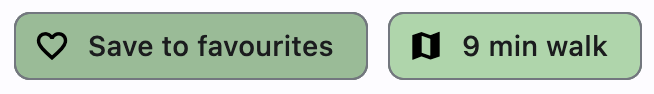
Assist chips
Assist chips are chips with leading icon and on_click event specified. They represent smart or automated actions that appear dynamically and contextually in a UI.
An alternative to assist chips are buttons, which should appear persistently and consistently.
loading...
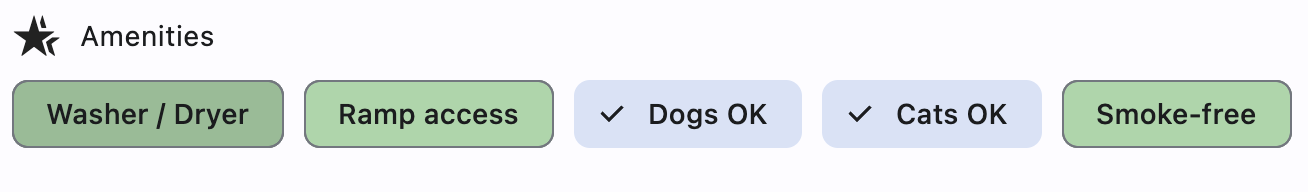
Filter chips
Filter chips are chips with on_select event specified. They use tags or descriptive words provided in the label to filter content. They can be a good alternative to switches or checkboxes.
loading...
Properties
autofocus
True if the control will be selected as the initial focus. If there is more than one control on a page with autofocus set, then the first one added to the page will get focus.
bgcolor
Color to be used for the unselected, enabled chip's background.
border_side
Defines the color and weight of the chip's outline.
Value is of type BorderSide.
check_color
Color of the chip's check mark when a check mark is visible.
click_elevation
A non-negative value which defines the elevation of the chip when clicked/pressed.
Defaults to 8.0.
clip_behavior
The content will be clipped (or not) according to this option.
Value is of type ClipBehavior and defaults to ClipBehavior.NONE.
color
The color that fills the chip in various ControlStates.
delete_drawer_animation_style
The animation style for the delete_icon's animations.
Value is of type AnimationStyle.
delete_icon_tooltip
The text to be used for the chip's delete_icon tooltip. If not provided or provided with an empty string, the tooltip of the delete icon will not be displayed.
delete_icon
A Control to display to the right of the chip's label in case on_delete event is specified.
Defaults to an Icon(icons.CANCEL).
delete_icon_color
Color of the delete_icon.
delete_icon_size_constraints
The size constraints for the delete_icon control.
When unspecified, it defaults to a minimum size of chip height or label height (whichever is greater) and a padding of 8.0 pixels on all sides.
Value is of type BoxConstraints.
disabled_color
The color used for the chip's background if it is disabled.
elevation
A non-negative value which defines the size of the shadow below the chip.
Defaults to 0.
enable_animation_style
The animation style for the enable and disable animations.
Value is of type AnimationStyle.
label
A Control that represents primary content of the chip, typically a Text. Label is a required
property.
label_padding
Padding around the label.
The value is an instance of padding.Padding class or a number.
By default, this is 4 logical pixels at the beginning and the end of the label, and zero on top and bottom.
label_style
The style to be applied to the chip's label.
Value is of type TextStyle.
leading
A Control to display to the left of the chip's label.
Typically the leading control is an Icon or a CircleAvatar.
leading_drawer_animation_style
The animation style for the leading control's animations.
Value is of type AnimationStyle.
leading_size_constraints
The size constraints for the leading control.
When unspecified, it defaults to a minimum size of chip height or label height (whichever is greater) and a padding of 8.0 pixels on all sides.
Value is of type BoxConstraints.
padding
The padding between the label and the outside shape.
The value is an instance of Padding class or a number.
By default, this is 4 logical pixels on all sides.
selected
If on_select event is specified, selected property is used to determine whether the chip is selected or not.
Defaults to False.
select_animation_style
The animation style for the select and unselect animations.
Value is of type AnimationStyle.
selected_color
The color used for the chip's background when it is selected.
selected_shadow_color
The color used for the chip's background when the elevation is greater than 0 and the chip
is selected.
shadow_color
The color used for the chip's background when the elevation is greater than 0 and the chip
is not selected.
shape
The shape of the border around the chip.
The value is an instance of OutlinedBorder class.
The default shape is a StadiumBorder.
show_checkmark
If on_select event is specified and chip is selected, show_checkmark is used to determine whether or not to show a
checkmark.
Defaults to True.
surface_tint_color
The color used as an overlay on bgcolor to indicate elevation.
visual_density
Defines how compact the control's layout will be.
Value is of type VisualDensity.
Events
on_blur
Fires when the control has lost focus.
on_click
Fires when the user clicks on the chip. Cannot be specified together with on_select event.
on_delete
Fires when the user clicks on the delete_icon.
on_focus
Fires when the control has received focus.
on_select
Fires when the user clicks on the chip. Changes selected property to the opposite value. Cannot be specified together with on_click event.