CupertinoAlertDialog
An iOS-style alert dialog.
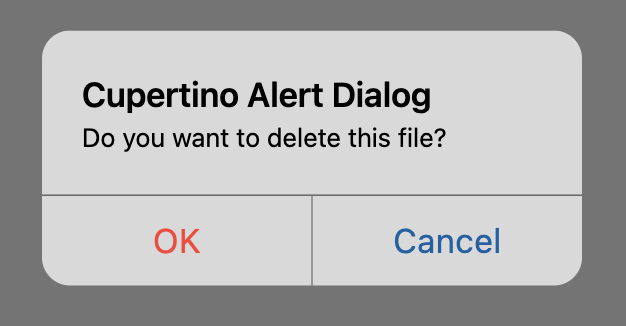
An alert dialog informs the user about situations that require acknowledgement. An alert dialog has an optional title and an optional list of actions. The title is displayed above the content and the actions are displayed below the content.
This dialog styles its title and content (typically a message) to match the standard iOS title and message dialog text style. These default styles can be overridden by explicitly defining text_style property.
To open this control, simply call the page.open() helper-method.
To display action buttons that look like standard iOS dialog buttons,
provide CupertinoDialogActions for the actions given to this dialog.
Examples
CupertinoAlertDialog and adaptive AlertDialog example
loading...
Properties
actions
The (optional) set of actions that are displayed at the bottom of the dialog.
Typically this is a list of CupertinoDialogAction controls.
barrier_color
The color of the modal barrier that darkens everything below the dialog.
If None, the DialogTheme.barrier_color is used.
If it is also None, then Colors.BLACK_54 is used.
content
The (optional) content of the dialog is displayed in the center of the dialog in a lighter font.
Typically this is a Column that contains the dialog's Text message.
inset_animation
The animation style to be used when the system keyboard intrudes into the space that the dialog is placed in.
Value is of type AnimationStyle.
modal
If set to True, dialog cannot be dismissed by clicking the area outside of it. The default value is False.
open
Set to True to display a dialog.
title
The (optional) title of the dialog is displayed in a large font at the top of the dialog.
Typically a Text control.
Events
on_dismiss
Fires when the dialog is dismissed.