DatePicker
A Material-style date picker dialog.
Depending on the date_picker_entry_mode, it will show either a Calendar or an Input (TextField) for picking a date.
To open this control, simply call the page.open() helper-method.
Examples
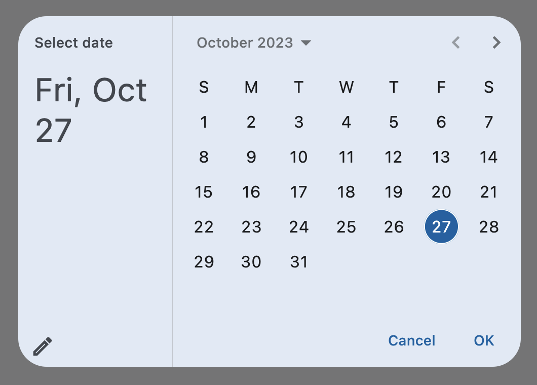
Basic date picker
loading...
Properties
barrier_color
The color of the modal barrier that darkens everything below the date picker.
If None, the DialogTheme.barrier_color is used.
If it is also None, then Colors.BLACK_54 is used.
cancel_text
The text that is displayed on the cancel button. Defaults to "Cancel".
confirm_text
The text that is displayed on the confirm button. Defaults to "OK".
current_date
The date representing today. It will be highlighted in the day grid.
date_picker_mode
Initial display of a calendar date picker.
Value is of type DatePickerMode and defaults to DatePickerMode.DAY.
date_picker_entry_mode
The initial mode of date entry method for the date picker dialog.
Value is of type DatePickerEntryMode and defaults
to DatePickerEntryMode.CALENDAR.
error_format_text
The error message displayed below the TextField if the entered date is not in the correct format.
Defaults to "Invalid format".
error_invalid_text
The error message displayed below the TextField if the date is earlier than first_date or later than last_date.
Defaults to "Out of range".
field_hint_text
The hint text displayed in the text field.
The default value is the date format string that depends on your locale. For example, 'mm/dd/yyyy' for en_US.
field_label_text
The label text displayed in the TextField.
Defaults to "Enter Date".
first_date
The earliest allowable date that the user can select. Defaults to January 1, 1900.
help_text
The text that is displayed at the top of the header.
This is used to indicate to the user what they are selecting a date for.
Defaults to "Select date".
keyboard_type
The type of keyboard to use for editing the text.
Value is of type KeyboardType and defaults to KeyboardType.DATETIME.
last_date
The latest allowable date that the user can select. Defaults to January 1, 2050.
switch_to_calendar_icon
Name of the icon displayed in the corner of the dialog when DatePickerEntryMode is DatePickerEntryMode.INPUT.
Clicking on icon changes the DatePickerEntryMode to DatePickerEntryMode.CALENDAR. If None, icons.CALENDAR_TODAY
is used.
switch_to_input_icon
Name of the icon displayed in the corner of the dialog when DatePickerEntryMode is DatePickerEntryMode.CALENDAR.
Clicking on icon changes the DatePickerEntryMode to DatePickerEntryMode.INPUT. If None, icons.EDIT_OUTLINED is
used.
value
The selected date that the picker should display.
Defaults to current_date.
Events
on_change
Fires when user clicks confirm button. value property is updated with selected date. e.data also contains the selected date.
on_dismiss
Fires when dialog is dismissed by clicking on the cancel button or outside of date picker dialog.
on_entry_mode_change
Fires when the date_picker_entry_mode is changed.
Event handler argument is of
type DatePickerEntryModeChangeEvent.