CupertinoButton
An iOS-style button.
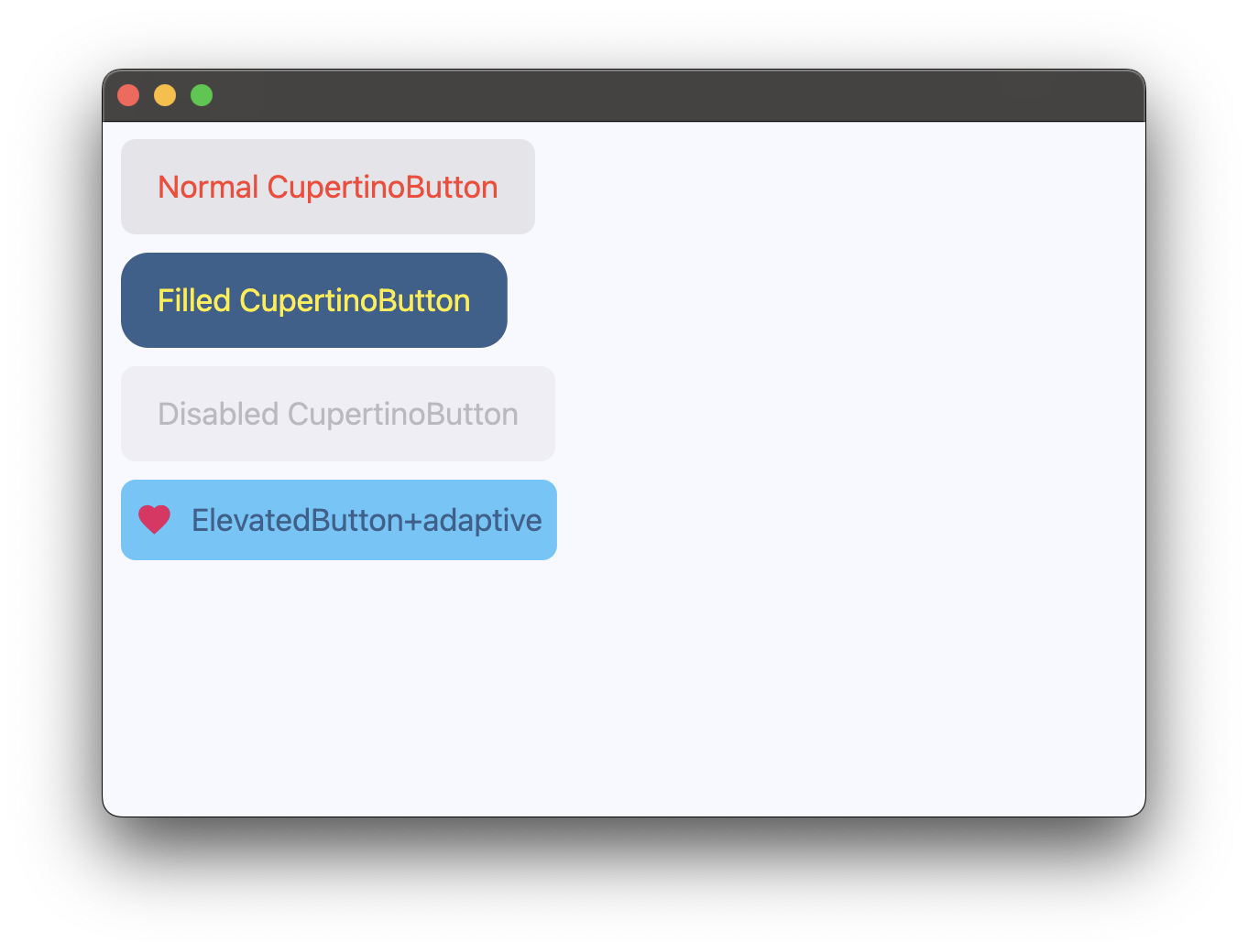
Examples
Basic Example
https://github.com/flet-dev/examples/blob/example-polishing/python/controls/cupertino/cupertino-buttons/cupertino-button-example.py
Properties
bgcolor
Button's background color.
color
Button's text color.
disabled_bgcolor
The background color of the button when it is disabled.
content
A Control representing custom button content.
icon
Icon shown in the button.
icon_color
Icon color.
min_size
The minimum size of the button.
Defaults to 44.0.
opacity_on_click
Defines the opacity of the button when it is clicked. When not pressed, the button has an opacity of 1.0.
Defaults to 0.4.
padding
The amount of space to surround the content control inside the bounds of the button.
text
The text displayed on a button.
tooltip
The text displayed when hovering the mouse over the button.
url
The URL to open when the button is clicked. If registered, on_click event is fired after that.
url_target
Where to open URL in the web mode.
Value is of type UrlTarget and defaults to UrlTarget.BLANK.
Events
on_blur
Fires when the button loses focus.
on_click
Fires when a user clicks the button.
on_focus
Fires when the button receives focus.
on_long_press
Fires when a user long-presses the button.