TextButton
Text buttons are used for the lowest priority actions, especially when presenting multiple options. Text buttons can be placed on a variety of backgrounds. Until the button is interacted with, its container isn’t visible. See Material 3 buttons for more info.
Examples
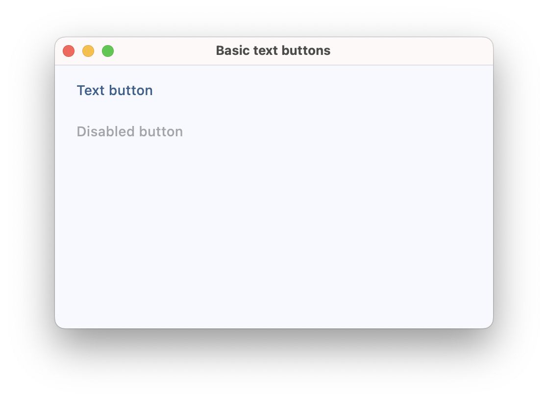
Basic text buttons
loading...
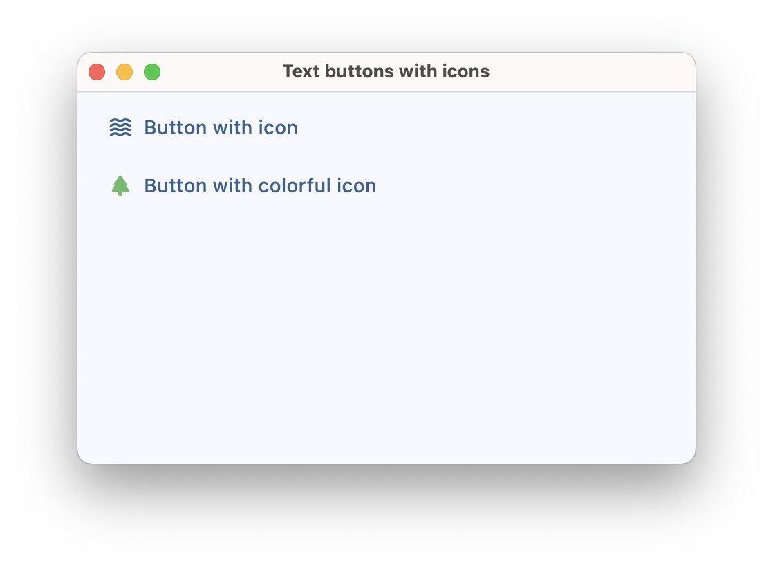
Text buttons with icons
loading...
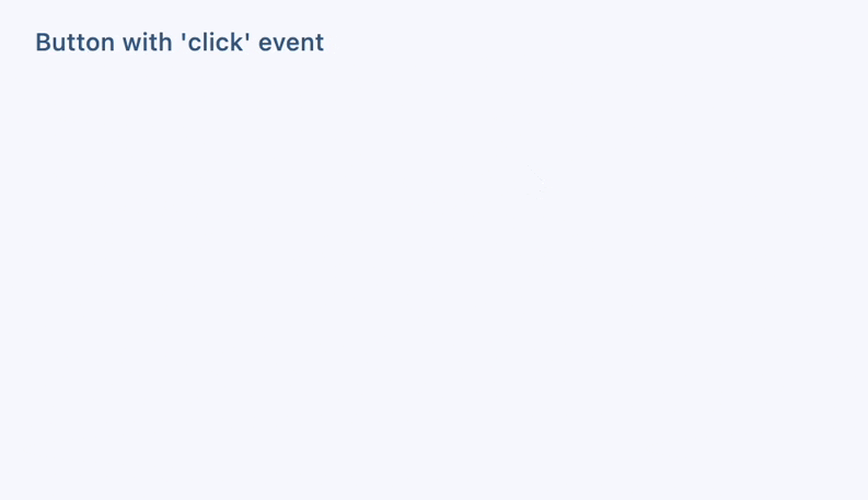
Text button with click event
https://github.com/flet-dev/examples/blob/example-polishing/python/controls/buttons/text-button/text-button-with-click-event.py
Text button with custom content
loading...

Properties
adaptive
If the value is True, an adaptive Button is created based on whether the target platform is iOS/macOS.
On iOS and macOS, a CupertinoButton is created, which matches the functionality and presentation of this button. On other platforms, a Material TextButton is created.
Defaults to False.
autofocus
True if the control will be selected as the initial focus. If there is more than one control on a page with autofocus set, then the first one added to the page will get focus.
content
A Control representing custom button content.
clip_behavior
The content will be clipped (or not) according to this option.
Value is of type ClipBehavior and defaults to ClipBehavior.HARD_EDGE.
icon
Icon shown in the button.
icon_color
Icon color.
style
Value is of type ButtonStyle.
text
The text displayed on a button.
tooltip
The text displayed when hovering the mouse over the button.
url
The URL to open when the button is clicked. If registered, on_click event is fired after that.
url_target
Where to open URL in the web mode. Value is of type UrlTarget and defaults
to UrlTarget.BLANK.
Methods
focus()
Moves focus to a button.
Events
on_blur
Fires when the control has lost focus.
on_click
Fires when a user clicks the button.
on_focus
Fires when the control has received focus.
on_hover
Fires when a mouse pointer enters or exists the button response area. data property of event object contains true (string) when cursor enters and false when it exits.
on_long_press
Fires when the button is long-pressed.