CupertinoListTile
An iOS-style list tile. The CupertinoListTile is a Cupertino equivalent of Material ListTile.
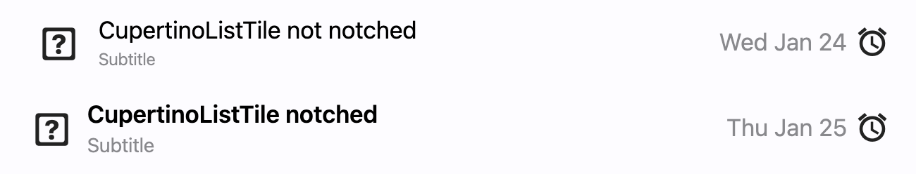
It comes in two forms, an old-fashioned edge-to-edge variant known from iOS Settings app and in a new, "Inset Grouped" form, known from either iOS Notes or Reminders app. The first form is created if notched property is False (default value) and the second form is created is notched is True.
Examples
loading...
Properties
additional_info
A Control to display on the right of the list tile, before trailing. Similar to subtitle, an additional_info is
used to display additional information. Usually a Text control.
bgcolor
The list tile's background color.
bgcolor_activated
The list tile's background color after the tile was tapped.
leading
A Control to display before the title.
leading_size
Used to constrain the width and height of leading control.
Defaults to 30.0, if notched=True, else 28.0.
leading_to_title
The horizontal space between leading and title.
Defaults to 12.0, if notched=True, else 16.0.
notched
If True, list tile will be created in an "Inset Grouped" form, known from either iOS Notes or Reminders app.
Defaults to False.
padding
The tile's internal padding. Insets a CupertinoListTile's contents: its leading, title, subtitle, additional_info and trailing controls.
Padding is an instance of Padding class.
subtitle
Additional content displayed below the title.
Typically a Text control.
title
A Control to display as primary content of the list tile.
Typically a Text control.
toggle_inputs
Whether clicking on a list tile should toggle the state of Radio, Checkbox or Switch inside the tile. Default is False.
trailing
A Control to display after the title.
Typically an Icon control.
url
The URL to open when the list tile is clicked. If registered, on_click event is fired after that.
url_target
Where to open URL in the web mode.
Value is of type UrlTarget and defaults to UrlTarget.BLANK.
Events
on_click
Fires when a user clicks or taps the list tile.