ProgressRing
A material design circular progress indicator, which spins to indicate that the application is busy.
A control that shows progress along a circle.
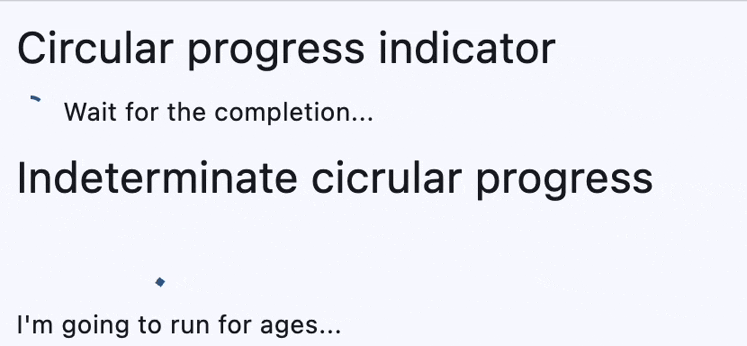
There are two kinds of circular progress indicators:
- Determinate. Determinate progress indicators have a specific value at each point in time, and the value should increase monotonically from
0.0to1.0, at which time the indicator is complete. To create a determinate progress indicator, use a non-null value between0.0and1.0. - Indeterminate. Indeterminate progress indicators do not have a specific value at each point in time and instead indicate that progress is being made without indicating how much progress remains. To create an indeterminate progress indicator, use a null value.
Examples
https://github.com/flet-dev/examples/blob/example-polishing/python/controls/information-displays/progress-ring/progress-ring.py
Properties
bgcolor
Color of the circular track being filled by the circular indicator.
color
The progress indicator's color.
semantics_label
The Semantics.label for this progress indicator.
semantics_value
The Semantics.value for this progress indicator.
stroke_align
The relative position of the stroke. Value typically ranges be -1.0 (inside stroke) and 1.0 (outside stroke).
Defaults to 0 - centered.
stroke_cap
The progress indicator's line ending.
Value is of type StrokeCap.
stroke_width
The width of the line used to draw the circle.
tooltip
The text displayed when hovering the mouse over the control.
value
The value of this progress indicator. A value of 0.0 means no progress and 1.0 means that progress is complete. The
value will be clamped to be in the range 0.0 - 1.0. If None, this progress indicator is indeterminate, which means
the indicator displays a predetermined animation that does not indicate how much actual progress is being made.